Building a Simple BI Solution in Excel 2013, Part 1
Reposted from Chris Webb's blog with the authors permission.
Unsurprisingly there’s been a lot of interest in Office 2013 since it was announced yesterday, and I’m certainly very excited by all of the new BI features in it. Luckily I wasn’t working today so I had the chance to have a proper play with it, and I thought it would be useful to walk through the process of building a simple BI solution in Excel 2013 to show off some of the new features.
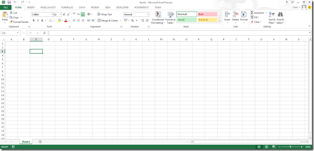
Let’s start with a blank workbook:
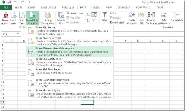
Some people don’t like the new look for Office, but I quite like it. You can even set custom backgrounds: you may just be able to see some wispy clouds in the top right-hand corner of the screenshot above. But anyway, to business. To import some data, I first need to go to the Data tab as normal:
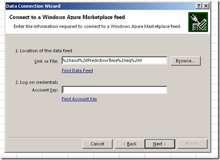
As you can see there are some new options available here, and I’m going to go to the Windows Azure Marketplace. Actually, I’m going to cheat a little and just say that I’m going to import the UK weather forecast from 12:00am today (July 17th) along with some related tables as described in this blog post. The UI for the import wizard is plain but functional:
Interestingly, the data is always imported at the end of the wizard even if I check the ‘Only Create Connection’ option on the last step of the wizard.
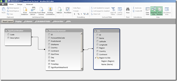
Once the data from all the tables has been imported, I need to specify some relationships. I can either do this by clicking on the Relationships button in the Data tab or (better still) going to the PowerPivot window and using the Diagram View. Now as I said yesterday, xVelocity in-memory database is now integrated into Excel but I still need to use the PowerPivot addin in some cases; The PowerPivot addin comes bundled with Excel 2013 but isn’t enabled by default, so in order to use it I first need to enable it; the steps to do this are detailed here. I can then click on the Manage button in the PowerPivot tab to open the PowerPivot window:
And then build some relationships between my tables in Diagram View, which can be reached by clicking on the small Diagram button in the very bottom right hand corner of the PowerPivot window. Once in the Diagram View, building relationships is simply a matter of dragging one column onto another:
I can also build hierarchies here; Duncan Sutcliffe shows how to do this here, and also how to use hierarchies in Power View which is something new. I’ve created a hierarchy going from Region to Weather Station.
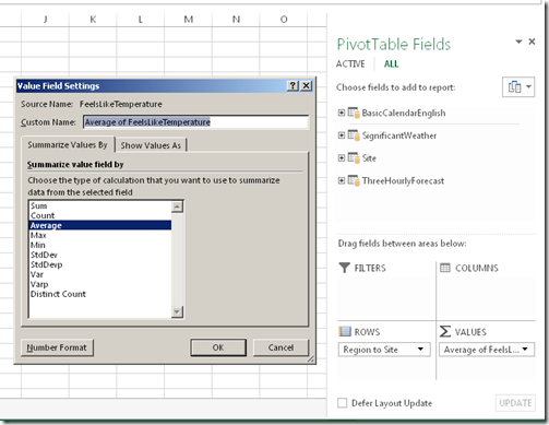
With that done I can of course build a PivotTable. The first thing I’ve noticed is that there isn’t now a separate type of PivotTable for PowerPivot, which is kind of a shame because this means that you don’t seem to be able to create Slicers in the Field List any more, and have to go up to the Ribbon. It’s good for consistency though I suppose. Measure aggregation and number formats are all handled in the Value Field Settings dialog:
There’s a new type of Slicer available too for dates called the TimeLine which Raphael has a lot of good detail on here.
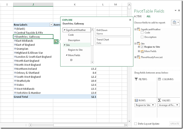
Here’s what the new Quick Explore option, which provides some options on where to drill to and for charts to create, looks like when I hover over a Region on Rows:
Really, though, the thing to do is to create a Power View sheet. This can be accomplished by going to the Insert tab and clicking the Power View button:
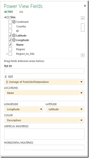
This is where things get exciting. Power View in Excel now supports maps and because my weather data contains the latitude and longitude of all of the weather stations in the UK it’s very easy to plot each weather station on a map and visualise the temperature and predicted weather for each station. To do this I just need to drop the Region Name column onto the Filters selection (choosing a region reduces the number of Weather Stations displayed down to a manageable number for the purposes of this demo), then drop the Latitude and Longitude columns onto the main canvas, turn the resulting table into a map, and then set the size of the markers to show temperature and the colour to show the type of weather:
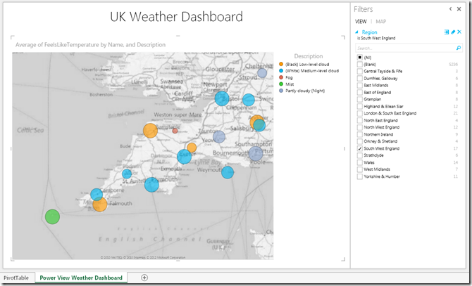
I’ll be speaking at SQL South West this week so what’s the weather like down there at the moment?
From this I can see that today there’s fog in the Scilly Islands (shown by the green marker in the bottom left hand corner) and that it’s very cold and foggy in Liscombe (shown by the small red marker in the middle of the map). This dashboard was ridiculously easy to create, by the way, and I am already completely in love with Excel 2013 simply because of Power View – it’s a killer feature in my opinion.
At this point we’ve got a working self-service BI solution, made very quickly in Excel 2013 and it’s something that every competent Excel user would be able to achieve.
In Part 2, you’ll see how you can share this solution with your co-workers in the Office Web App.
 |
Chris has been working with Microsoft BI tools since he started using beta 3 of OLAP Services back in the late 90s. Since then he has worked with Analysis Services in a number of roles (including three years spent with Microsoft Consulting Services) and he is now an independent consultant specialising in complex MDX, Analysis Services cube design and Analysis Services query performance problems. His company website can be found at http://www.crossjoin.co.uk and his blog can be found at http://cwebbbi.wordpress.com . |
Tags: excel, powerpivot, tabular

