Analysing #SQLPASS Tweets using NodeXL
Reposted from Chris Webb's blog with the author's permission.
I've got a large backlog of serious technical blog posts to write but today, since I'm still recovering from my trip to the PASS Summit in Seattle last week, I couldn't resist going back to my favourite data visualisation tool NodeXL and having some fun with it instead. Anyone that saw the keynotes last week will know that the future of BI is all about analysing data from Twitter - forget about that dull old sales or financial data you used to use on your BI project - and so, inspired by Sam Vanga's blog post from today on that same topic I decided to take a look at some Twitter data myself.
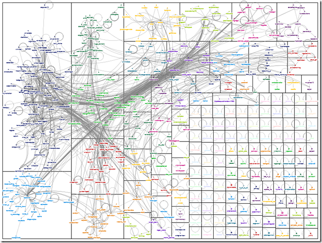
In NodeXL I imported 1757 tweets from 515 different people that included the #sqlpass hashtag from the 8th of November when Twitter activity at the conference was at its peak (I couldn't import any more than that - I assume Twitter imposes a limit on the number of search results it returns). In basic terms, when NodeXL imports data from Twitter each Twitter handle becomes a point on a graph, and a line is drawn between two Twitter handles when they appear in a tweet together. I won't bother going into any detail about how I built my graph because analysing the results is much more interesting, so I'll just say that after playing around with the clustering, layout and grouping options here's what I came up with:
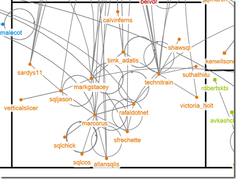
It looks very pretty from this distance but it's not very useful if you can't read the names, so I saved a much larger .png version of this image here for you to download and explore, and if you've got NodeXL you can download the original workbook here (don't bother trying to open it in the Excel Web App). It's fascinating to look at - even though the data comes from a very restricted time period the cliques in the SQL Server world emerge quite clearly. For example, here's the group that the clustering algorithm has put me in (I'm @Technitrain), which is at the bottom of the graph on the left-hand side:
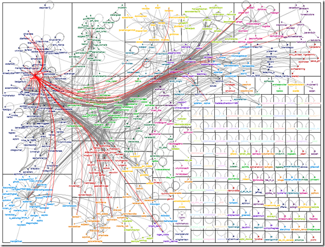
There's a very strong UK/SQLBits presence there (@timk_adatis and @allansqlis for example), but also a strong BI presence as well with @marcorus and @markgstacey, which is pretty much what you'd expect. There are several other small groups like this, plus a large number of unconnected people in groups on their own in the bottom right-hand corner of the graph, but on the top left-hand side there's a monster group containing a lot of well-known SQL Server personalities. Jen Stirrup (@jenstirrup) is right in the centre of it, partly because she's one of the SQL Server Twitter royalty and partly because of her well-deserved PASSion award that day. Highlighting in red just the tweets that involved her shows at the very highest level how well-connected she is:
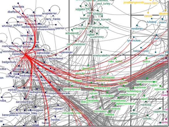
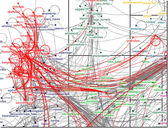
Keeping Jen selected and zooming in shows the people clustered together with Jen a bit better:
Selecting not only Jen's tweets but also the tweets of the people who tweeted to her and also to each other (which is one of many useful features in NodeXL), highlights just how close the members of this group are:
This is clearly where the popular kids hang out.
Anyway, I hope this gives you an idea of the kind of thing that's possible with NodeXL and Twitter data and inspires you to go and try it yourself. Hell, NodeXL is so much fun it might prove to the DBA crowd that BI doesn't need to be boring!
 | Chris has been working with Microsoft BI tools since he started using beta 3 of OLAP Services back in the late 90s. Since then he has worked with Analysis Services in a number of roles (including three years spent with Microsoft Consulting Services) and he is now an independent consultant specialising in complex MDX, Analysis Services cube design and Analysis Services query performance problems. His company website can be found at http://www.crossjoin.co.uk and his blog can be found at http://cwebbbi.wordpress.com/ . |

